Q4 begins with more updates to the Admin Dashboard

Ever since the launch of the new Admin Dashboard, we are committed to ensuring consistency in the look-and-feel and steer the interface design to be intuitive regardless of your use case.
TOPIC CATEGORIES MANAGER
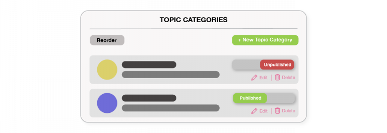
Now a dedicated interface, you can get an overview of the created Topic Categories, their respective detailed information, as well as publish statuses. In the same view, you have the option to create a new category, reorder the existing, and edit, publish/unpublish and delete any of the selected.
Now available to all Project Owners and Administrators!
EMAIL TEMPLATE CUSTOMIZERS

We have introduced a “Preview” window where you can immediately review the changes made to the email template codes. The tabs also allow you to quickly toggle between the 2 views.
Now available to all Project Owners and Administrators!
NAVIGATION SIDEBAR
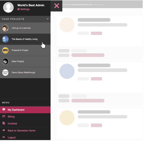
Reorganized colours and buttons
All sidebar buttons are put into 2 categories – Project and non-Project, with each having its unique style and colour. Project buttons are where you manage the content you own and administer, and non-Project buttons are where you perform platform-level functions.
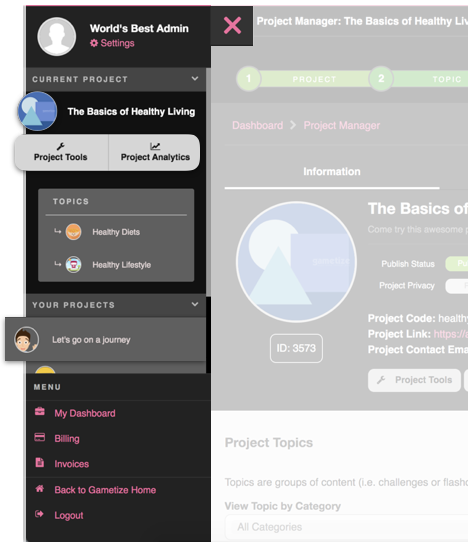
New Projects list and buttons
We have one goal here – to make it easier for you to identify the Project you are looking for. Therefore, addition of Project icon to the list, greater color contrasts, and a different styling for the Project Tools and Analytics buttons.
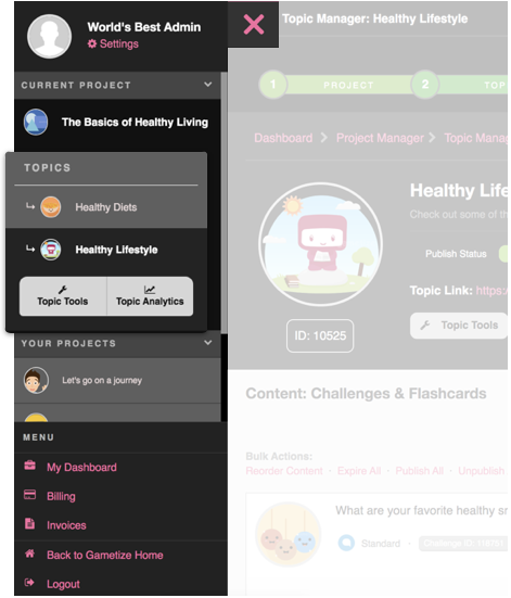
New Topics list and buttons
The Topics list has a different styling to keep it unique from the Projects list. But, we’ve modeled the Topic Tools and Analytics buttons against that of the Project to keep the UI consistent.
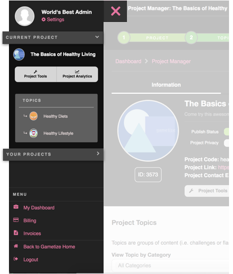
Expanding and Collapsing the Projects list
We are at hyper-organization mode here!
- Collapse the current Project you are working on to quickly select another – less scrolling!
- Collapse all other Projects you own or administer to prevent any distraction
- Collapse everything to clean up your side
